"Art is the only way to run away without leaving home" (Twyla Tharp)
Showing posts with label Watercolor. Show all posts

Rose Mallee ...


Eucalyptus rhodantha
Rose Mallee - © Vicki Lee Johnston

It has been ages since I posted a blog update but sometimes I think we need to allow the process to find its own flow ... it should never be forced unless it's a commission or exhibition deadline but in terms of communicating in a social way sometimes less is more while you get your bearings.


The great thing about the creative process is being able to find a community that supports and encourages without constant expectation.  I belong to a few art societies which are very welcoming and always communicate upcoming projects, exhibitions, publications and invite participation wherever possible, despite where you are located.  One such project was run by the American Society of Botanical Artists (ASBA) to celebrate their recent silver anniversary.  

As I am a Member of the ASBA, I was invited to contribute to their publication by painting a subject within the theme of 'silver' whether it be silver leaves, silver in the name of the plant, etc.  I wasn't going to participate due to a very busy calendar and overseas travel at the time, but on one of my road trips I came across the Eucalyptus rhodantha, Rose Mallee, which happened to be in flower on the roadside.


It is a beautiful small tree, if somewhat scraggly and messy at times - however once it comes into bud and flowers - wow, it's a showstopper.  It's endemic to my region and seemed a perfect subject to choose to paint considering the glaucous silver blue leaves and powdery grey buds .... just right for the job description at hand - and especially meaningful being an artwork portraying a West Australian native plant published in an international publication.


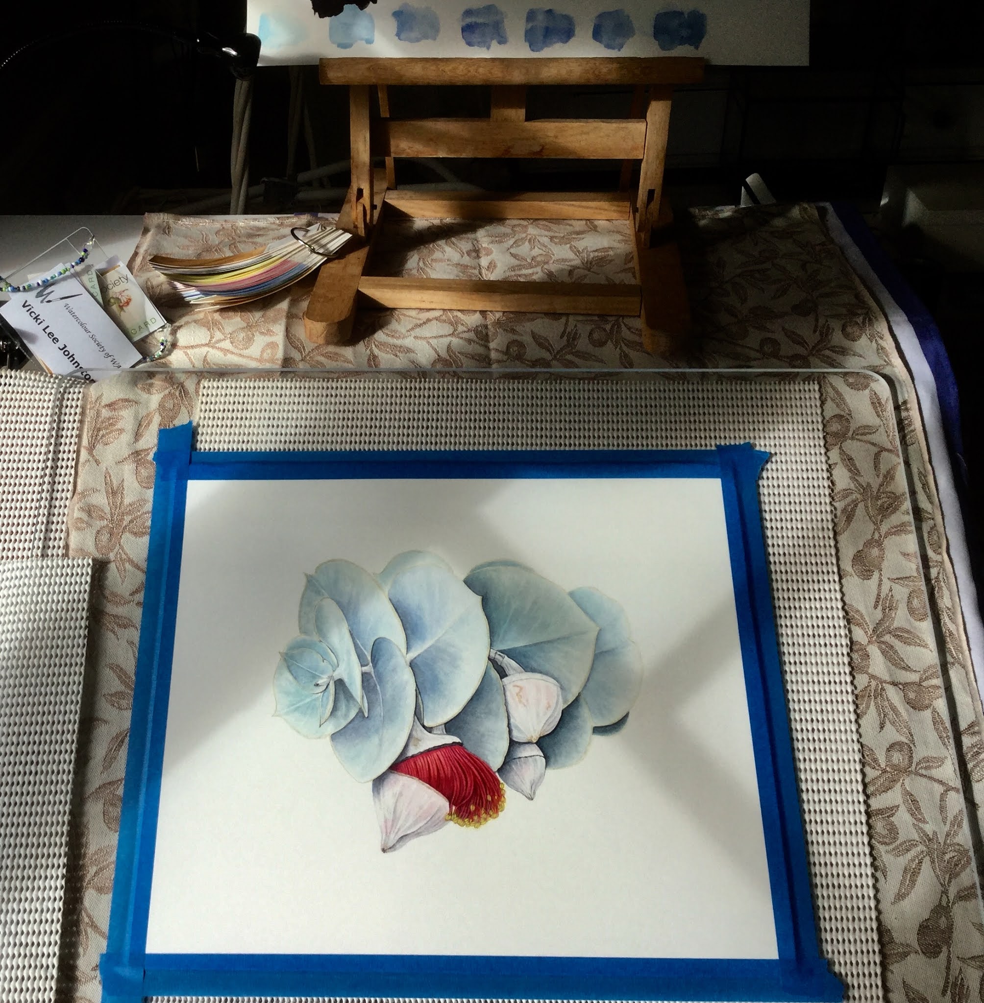
WIP - first layers of paint going on ...


I realised once again I had put myself under the pump time wise, as was due to travel within days so I decided just get it done, I loved the subject and once all the colour studies were done, I really hurried the layers of silver grey/blue on the leaves and started building up the shadows to create depth and form.


The powdery greyish silver was a joy to paint, keeping in mind less is more and only painting the shadows and a very subtle silver grey hue.  I then added the raspberry red of the flower, trying to show the light and shade to highlight the details and finally the minute details of the stamen.  The photos are very poor due to me working late into the night.  I had three days from start to finish to complete the painting, which is probably a good thing to avoid overworking.


Probably the most difficult part for many artists could often be the technology associated with exhibiting, publishing and showing artworks.  Being able to photograph, scan, convert files, edit, then ensure you have met the technical criteria for a publication, as it could end up less than complimentary to your work if the colours and light are off.  Fortunately all deadlines were met and the artwork was sent digitally to the society and able to be entered into this beautiful book celebrating their members, their art and the society as an international and inclusive organisation.


It was a few months before the book was published and it took quite a bit longer to reach Western Australia.  It was published in limited numbers, so somewhat of a collectors piece and I am very grateful for my edition.


Excuse the poor quality photo, not easy taking a pic from a glossy book ... but you get the gist! 
For further information here is the website for the American Society of Botanical Artists:


I have a number of artworks in the members gallery - which reminds me, I need to update that too!  Never ending tech alongside art and creation ... guess it keeps both sides of the brain in tune!


Rose Mallee - © Vicki Lee Johnston 


All artwork and images © Vicki Lee Johnston 2020

Forest Floor ...


'Forest Floor' © Vicki Lee Johnston

The painting 'Forest Floor' came about after a call to artists to advise of an awards exhibition being held at a local gallery.  I always try to be involved where possible, even if the exhibit is not strictly botanical.


I had just over a week to compose, draw and paint the artwork and these creative ideas don't happen instantly.  I did what I always do when my mind isn't able to co-operate and went for a long walk in the hills nearby.  One thing I always notice in summer are the leaves on the ground, while they may be terribly messy and hard work to keep under control, I always seem to get lost in their beauty even though they are well beyond their best.


On this occasion I gathered a handful of half dead and dying leaves, a couple of gum nuts and took them inside where I laid them out in a pleasing mandala style pattern.  It was easier to see how a drawing might come to fruition and how the colours and formation interplayed with the design.  Our suburb in the hills of Perth is known as 'a home in the forest' for the beautiful green belt and natural environment, so the name became obvious to me as everyone living here would see this as such a familiar sight at their feet on the ground, and I had been playful with the outcome.


Decision made, I drew the leaves and gum nuts and set about painting them in the most lifelike way, trying to show the highlights and deep shadows to assist the piece in looking more three dimensional.


This was a kind of stop-start painting, which is unusual for me.  Usually I become somewhat obsessed with my artwork and slave over it for hours on end to the detriment of both my enjoyment and the artwork.  I simply didn't have the time what with renovations, Christmas, New Year etc., and was only able to paint for an hour here and there.  I found this process much more enjoyable and allowed me to step away and see it with new eyes more often. 


The leaves were very earthy colours with a few still quite green ... all having fallen from the trees on our property, my poor husband spends hours raking them up and looked quite bemused when he saw me bringing them inside.  


I enjoyed painting the gum nuts immensely but really took my time building up the washes and leaving the highlights and shadows to unfold slowly so I didn't overpaint them.
They really needed to look rounded and solid to enhance the overall idea.


Looking sideways at the painting often helps me 'see' whether the painting starts to leap off the page.


Finally stepping away from the painting,  I placed it upright and visited it at different times of the day!  I like to look at a painting from all angles to see if it appears realistic enough, before settling on the finishing touches, unfortunately time was tight but thankfully the details weren't too complicated and I finished in the nick of time.


I chose a box frame this time, with a nice amount of depth and shadow to the overall effect, choosing a very neutral frame and mat to allow the leaves and gum nuts to take centre stage.


What an absolute joy to be informed that my painting had been announced Winner of the two dimensional category at the Annual Art Awards - I hadn't been able to attend the big launch party and while I was sad I couldn't be there this was a beautiful keepsake to all my work.


I think it is very important for botanical artists to spread their wings and become involved in exhibitions from all genres, allowing yourself to be more creative and share the beauty of the natural world through observation and detail, this was a wonderful endorsement of this art form.  I finally managed to visit the gallery and enjoy the whole exhibition, there are so many beautiful works of art in all mediums and styles and I feel very honoured to have been shown among them.


The exhibition is open all this weekend - at the beautiful Zig Zag Gallery in Kalamunda, 
Western Australia.


All images © Vicki Lee Johnston

Watercolours ...


Greetings card © Vicki Lee Johnston

I hope this year has been a fruitful one for you - I know many family and friends have had a hectic time of it and felt the year has been a whirlwind.  That's certainly how I feel but a lot of things have been accomplished despite the busy-ness and has led to thinking about ways to savour the things we enjoy and make what we do more manageable and organised so we don't get bogged down with stuff.  Decluttering is a big part of the process, not only our belongings but also the way we work, to only have what is beautiful and useful in our homes and workspaces.


I love colour, especially watercolour - and I find the pigments fascinating also. The more I learn about pigment properties, the more I realise that the colour I choose in the first instance can save a lot of time in the long run.  How many times have we gotten further into a painting only to realise that a colour is not behaving the way we want, either it's too opaque, we can't lift it because it's heavily staining, the colour is granulating when we want a smooth wash ... if we familiarise ourselves with each pigment it can avoid a lot of problems and potentially save a painting.


My first teacher showed me how it was possible to make hundreds of colours from only six, a warm and cool choice of yellow, blue and red.  The colour charts above are the very first thing I painted and I learnt a lot about colour mixing.  However I had no idea that there was so much more to it!


After frustrating errors with watercolour finishes I became more interested in why these problems were happening, why I couldn't lift a colour, or why my colours weren't smooth.


 Soo many colour charts!  Learning how each pigment works ...


As you can see, I have done a lot of homework and tried to familiarise myself with each colour and divided it into cards showing the range of colours and properties for each one.
However, it's all very well having the colour charts in a nice filing system, now it's time to find the watercolours I need for a painting and because I have too many they reside in multiple tins and drawers and I find myself becoming a bit disorientated before I even begin laying the first wash.  I  wanted something to house all the stuff I need to get going, for it to be easy to find, easy to sort and categorise and still look neat once packed away.  Although things can get chaotic during a painting, I like to be able to pack things away in their place.


My studio, loads of places for all the stuff!
The most recent painting involved painting a lot of different leaves and quite a few colours.  This is when I realised my system wasn't working.


 I haven't worked out yet whether I prefer tubes or pans, but I am leaning towards watercolour pans.  I have bought a lot of empty watercolour full size pans and fill them from my Daniel Smith and Schmincke tubes but tend to buy Winsor & Newton pans due to recommended use by the manufacturer.


 I posted a question asking for suggestions in the  Botanical Artists Facebook Group, where you get loads of advice from fellow artists.  So many ideas were given which were very helpful.  Ultimately we have to find what works for us and in this situation I need storage and organisation, something to keep all the colours and charts in that I can take out of a cupboard or close up at the end of the day and it all looks neat.  It's not specifically a travel case, although it could easily be used for one, but if I were travelling I would definitely minimise my watercolours and tools and travel with a smaller setup.


This case was the perfect solution, it's a make up carry case but you could easily get a fishing tackle box or sewing basket, a wooden box, etc.  I liked the way the sections opened up and made it easy to see everything.    My husband very kindly cut up flyweight stiffener into squares for the base and also strips to fit in between the rows to allow for detailed labelling.  You could easily use foam core board for this job.  I find the tins which hold pans leave little room for labelling and if you want all the pigment info it's a bit fiddly, it's also not easy to take the pans out and use elsewhere.  I tend to splash around a bit and make a right mess in a tin!  Using this system I can easily take out only the pans I need and use them with my china palette.

When you first open the case


The sections fully expanded

I decided to use each square section for specific colours, top right are yellows, top left reds, bottom right blues, bottom left violets, browns and grey/black.  


Each pan is described by using an erasable pen on a sticker label and pasting it to the flyweight strip.  Of course you could also use foamcore board to put the base and sections it as well.  I wanted a decent space so I could see everything at first glance.


I leave all my colour cards and charts together at the base of the case.  The watercolour pad I used to make these charts is a perfect size to fit inside the case and under the tiers for easy access.


Underneath those charts are small boxes containing all the tube colours which I have used to fill the pans, all in their own colour sections relating to the trays above.  I also fit my colour strip fan in amongst those boxes, you can see it laid out below, with all the colour strips relating to the pigments in the case.  This colour strip fan is wonderful for choosing the right colour for a botanical subject as you can easily hold it over the subject and see through the hole punch area to get the closest match.


Voila!

My new case with a rainbow of colours and colour charts and all the technical information needed!  It can be kept in a very small space and is portable.  I know it will save me a lot of time working out the colours I need - whether they be transparent, opaque, granulating, staining, single pigment, etc.  It will become second nature and eventually I will probably minimise the colours I use down to a much more manageable size.  You could also easily fit paintbrushes and a few ceramic palettes in the case so it's a very worthwhile option if you are feeling a bit disorganised and finding getting started on a painting frustrating due to chaos in the studio.  As mentioned before, this is more of a hold-all than a travel case, you don't need to take the whole kitchen sink when you travel or are out in the field!


My next painting is well under way,  very short deadline on this as it is due for an exhibition in early January.    

© Vicki Lee Johnston

I hope you find this blog post helpful and it encourages you to find a system that works for you.  We all work differently but most of all our creativity doesn't have to be limited to our artworks.  

"Necessity is the mother of invention" 


Facebook page:

Instagram: